Card
Surface card primitive with padding presets (none to 3xl), interactive hover state, and background media props. Ideal for media-rich product cards and feature tiles.
// Plain markup
import { Card, CardList, CardListItem, CardRow, StatCard } from "@shavin/ui";
Product Card (Image + Details)
A media-rich product card with an image header, title, and description — the most common real-world card pattern.
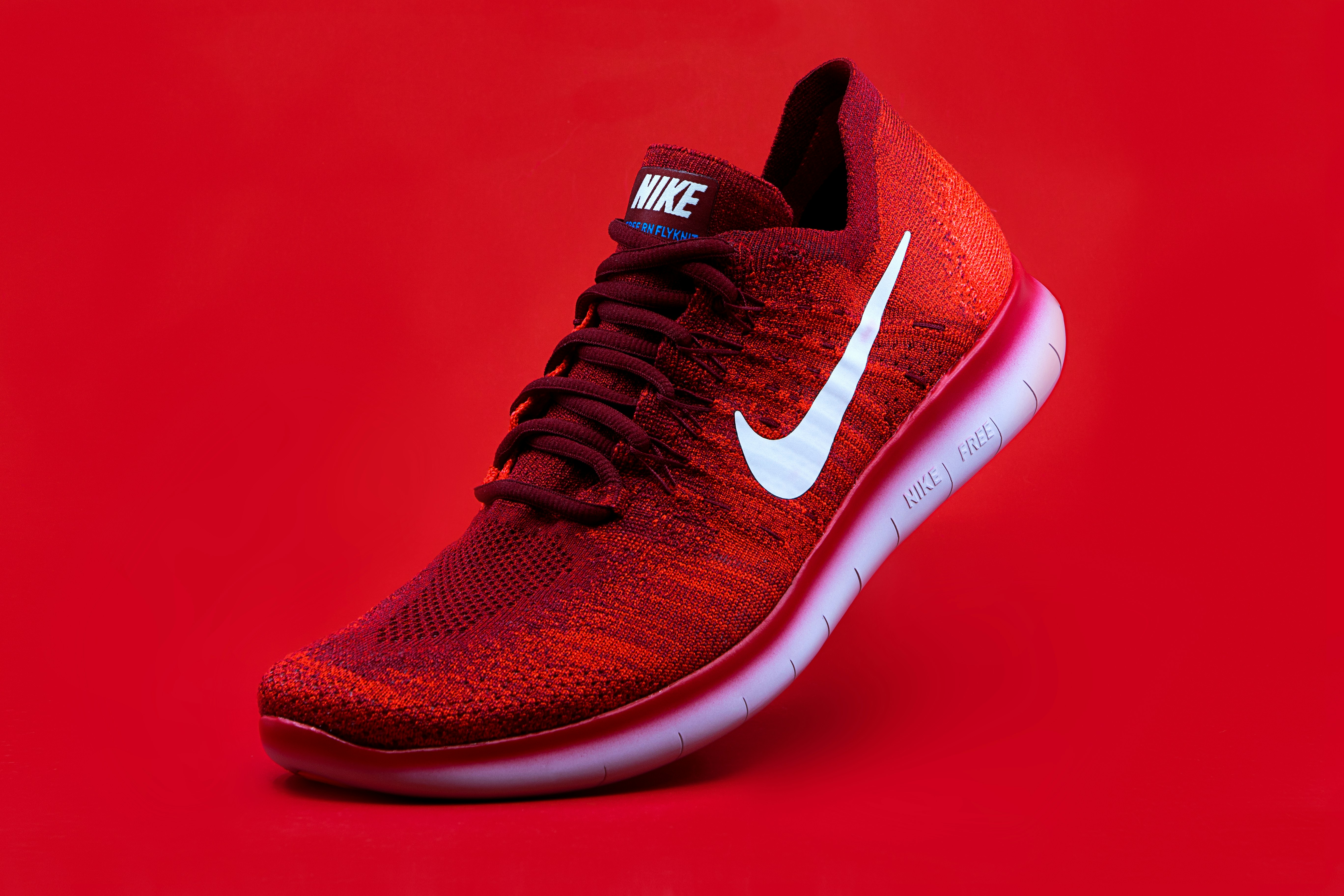
<Card className="w-64 overflow-hidden border border-hairline bg-surface shadow-card">
  <img
    src="https://images.unsplash.com/photo-1542291026-7eec264c27ff"
    alt="Product"
    className="h-32 w-full object-cover"
  />
  <div className="p-4 space-y-2 text-left">
    <div className="text-sm font-semibold text-fg">Product Name</div>
    <div className="text-xs text-fg-muted leading-relaxed">A premium product with elegant design and quality materials.</div>
  </div>
</Card>
Card (Padding Spectrum: none to 3xl)
<Card padding="none">none (0px)</Card>
<Card padding="xs">xs (8px)</Card>
<Card padding="sm">sm (16px)</Card>
<Card padding="md">md (20px)</Card>
<Card padding="lg">lg (24px)</Card>
<Card padding="xl">xl (32px)</Card>
<Card padding="2xl">2xl (40px)</Card>
<Card padding="3xl">3xl (48px)</Card>
Background Media
Card accepts bgVideo, bgImage, bgOverlays, bgSize, and bgVideoPaused props. Ideal for media-rich product cards, feature cards with video thumbnails, or immersive content tiles.bgOverlays supports comma-separated shorthand: presets (dark-50), hex colors (#ff5733/50), semantic tokens ((accent)/30), and gradients (linear(45deg, #000/0%, #000/100%)/80). Mix freely in one string.
Card with Background Image + Gradient Overlay
A Card with a background image and gradient-bottom overlay. Content sits above the media via z-10 wrapper.

Feature Card
gradient-bottom overlay for bottom-aligned text.
<Card
  padding="lg"
  bgImage="https://images.unsplash.com/photo-1789677802125-ca4e0f676e05"
  bgOverlays="gradient-bottom"
  surface="dark-always"
  className="h-[280px] overflow-hidden"
>
  <Flex direction="column" justify="end" gap="2">
    <Heading size="md">Feature Card</Heading>
    <Text size="xs" color="muted">gradient-bottom overlay for bottom-aligned text.</Text>
  </Flex>
</Card>
Card with Background Video + Multi-Layer Overlays
Background video with two overlay layers: dark-50 base for text legibility plus a scrim gradient for depth.
Video Card
dark-50 + scrim@70% — two-layer overlay.
<Card
  padding="lg"
  bgVideo="https://videos.pexels.com/video-files/39524985/16839566_1920_1080_24fps.mp4"
  bgOverlays="dark-50, scrim/70"
  surface="dark-always"
  className="h-[260px] overflow-hidden"
>
  <Flex direction="column" justify="end" gap="2">
    <Heading size="md">Video Card</Heading>
    <Text size="xs" color="muted">dark-50 + scrim@70% — two-layer overlay.</Text>
  </Flex>
</Card>
Card with Custom Gradient + Token Overlay
Custom linear gradient with hex stops and a semantic accent token — no JSON needed.
Custom Overlays
Hex solid + gradient + accent token — shorthand only
<Card
  padding="lg"
  bgImage="https://images.unsplash.com/photo-1789677802125-ca4e0f676e05"
  bgOverlays="#1a1a2e/30, linear(180deg, #000/0%, #000/100%)/60, (accent)/10"
  surface="dark-always"
  className="h-[260px] overflow-hidden"
>
  <Flex direction="column" justify="end" gap="2">
    <Heading size="md">Custom Overlays</Heading>
    <Text size="xs" color="muted">Hex solid + gradient + accent token — shorthand only</Text>
  </Flex>
</Card>
Overlay Presets
bgOverlays accepts comma-separated shorthand for all overlay types. Presets (below) are the simplest form. You can also use solid colors and gradients:
| Syntax | Example | Description |
|---|---|---|
| presetKey | "dark-50" | Named preset at 100% opacity. |
| presetKey/opacity | "scrim/90" | Named preset at custom opacity (0–100). |
| #hex/opacity | "#ff5733/50" | Solid hex color with optional opacity. |
| (token)/opacity | "(accent)/30" | Semantic token color with optional opacity. |
| linear(angle, stops)/opacity | "linear(45deg, #000/0%, #000/100%)/80" | Linear gradient with angle and color stops. Each stop: color/offset%. |
| radial(stops)/opacity | "radial((accent)/0%, (accent)/100%)/60" | Radial gradient with color stops. No angle needed. |
Combine multiple layers with commas. Mix presets, solids, and gradients freely:
bgOverlays="dark-20, (accent)/30, linear(90deg, #000/0%, #000/80%)/70"Preset keys below are shorthand for common scrim/gradient patterns. The preview column shows the overlay composited over a checkerboard.
| Preview | Preset | Description |
|---|---|---|
| dark-20 | Solid black at 20% opacity — subtle darkening for light readability. | |
| dark-30 | Solid black at 30% opacity — moderate darkening. | |
| dark-50 | Solid black at 50% opacity — strong darkening for white text legibility. | |
| dark-75 | Solid black at 75% opacity — heavy darkening for dramatic contrast. | |
| light-20 | Solid white at 20% opacity — subtle lightening for dark readability. | |
| light-30 | Solid white at 30% opacity — moderate lightening. | |
| light-50 | Solid white at 50% opacity — strong lightening for dark text legibility. | |
| gradient-bottom | Linear gradient from transparent (top) to 80% black (bottom) — for bottom-aligned text overlays. | |
| gradient-top | Linear gradient from transparent (bottom) to 80% black (top) — for top-aligned text overlays. | |
| gradient-radial | Radial gradient from transparent (center) to 85% black (edges) — focused-center vignette. | |
| vignette | Radial gradient from transparent (40% radius) to 85% black (edges) — classic vignette. | |
| scrim | Soft linear gradient from 10% (top) to 85% (bottom) black — gentle content scrim. |
StatCard
Due this month
12
Outstanding
$1,240
amount
Overdue
3
Paid this month
$860
4 cleared
<StatCard label="Due this month" value="12" />
<StatCard label="Outstanding" value="$1,240" sub="amount" />
<StatCard label="Overdue" value="3" alert />
CardList + CardListItem (clickable rows)
<CardList>
  <CardListItem className="cursor-pointer">
    <span className="flex-1">Netflix subscription</span>
    <span className="text-sm text-fg-muted">Tomorrow</span>
  </CardListItem>
</CardList>
CardRow (settings-style form)
Name
<div className="divide-y divide-hairline rounded-[var(--radius-panel)] border border-hairline bg-surface">
  <CardRow label="Name"><span>Jordan Rivera</span></CardRow>
  <CardRow label="Email"><span className="text-fg-muted">jordan@example.com</span></CardRow>
</div>
Props
| Prop | Type | Default | Description |
|---|---|---|---|
| bgVideo | string | — | Background video URL (mp4, webm, etc.). Renders an autoPlay/loop/muted <video> element behind children. |
| bgImage | string | — | Background image URL. Renders an <img> with object-cover (default) or object-contain. |
| bgSize | "cover" | "contain" | cover | Background media fit. "cover" fills the container (default), "contain" fits within. |
| bgOverlays | string | — | Comma-separated shorthand for overlay layers. Supports presets ("dark-50"), solid colors (#hex or (token)), and gradients (linear/radial). JSON array of OverlayLayer[] as fallback for advanced cases. Layers composite top-to-bottom. |
| bgVideoPaused | boolean | false | When true, pauses the background video (renders a static poster frame instead of autoplay). |
| padding | "none" | "xs" | "sm" | "md" | "lg" | "xl" | "2xl" | "3xl" | "none" | — |
| interactive | "true" | "false" | "false" | — |
StatCard API Reference
| Prop | Type | Default |
|---|---|---|
labelrequiredShort label shown above the metric value. | string | — |
valuerequiredThe primary metric value displayed prominently. | string | — |
subOptional secondary subtitle beneath the value. | string | — |
alertWhen true, renders the value in the danger color. | boolean | false |
paddingInternal padding preset. | "sm" | "md" | "sm" |